Photo by Myriam Jessier on Unsplash
Analysing Adidas Sales Data with Python
What's in it for you
What you will able to do after reading this article:
- Import data using Python via Google Colab
- Perform data-cleaning including finding missing values and handling dates
- Aggregate and visualise data
Let's first head to Google Colab and create a new notebook.
Next, in your notebook, mount your Google drive by running the codeblock below:
from google.colab import drivedrive.mount('/content/drive')
Import relevant packages as follows:
# Import packagesimport pandas as pdimport numpy as npimport osimport datetime as dtimport matplotlib.pyplot as pltimport seaborn as snssns.set(rc={'figure.figsize':(15,5)}) # To set the size of our chartsYou can download the data from Kaggle and upload it onto your Google Drive as a CSV file.
Load the data:
# Importing the datadf = pd.read_csv('/content/drive/My Drive/Adidas US Sales Datasets.csv')With any data we work with, we should spend some time understanding it by knowing the fields and their respective data types, the number of rows and columns in the data etc, which serves as a basic sanity check against the data.
# Understanding the dataprint(f"There are {df.shape[0]} rows and {df.shape[1]} columns.")print(f"Column names are {', '.join(df.columns)}.")print(f"Data types are {df.dtypes}")print(f"These are the first 5 rows of the data: {df.head()}")After running the above, you should see statements printed:
There are 9648 rows and 13 columns. Column names are Retailer, Retailer ID, Invoice Date, Region, State, City, Product, Price per Unit, Units Sold, Total Sales, Operating Profit, Operating Margin, Sales Method. Data types are ... These are the first 5 rows of the data: ... Now, we begin our data-cleaning process by starting with counting the number of missing values if any.# Missing valuesprint(f"Number of records with missing values by column: \n{df.isnull().sum()}")# No missing values - yay!We have a date field called Invoice Date but stored as an object data type. So, we convert the date field to datetime to later on extract year parts.
# Converting Invoice Date into date type, and extracting date parts from it like month, year# Let's first see how the values under Invoice Date look like to get the right date format laterprint(f"First few values under Invoice Date: \n{df['Invoice Date'][:10]}")# Values under Invoice Date follow the date format %m/%d/%Y i.e. month/day/yeardf["Date"] = pd.to_datetime(df["Invoice Date"], format = '%m/%d/%Y')print(f"First few values under Invoice Date and Date:\n{df[['Invoice Date', 'Date']][:10]}")# Check for any missing value under Date to ensure type conversion to date was successfulprint(f"Number of missing values under Date: {df['Date'].isnull().sum()}")# Get date partsdf["Year"] = df["Date"].dt.yeardf["Month"] = df["Date"].dt.month# Truncate to monthdf["Month Year"] = df["Date"].dt.to_period('M').dt.to_timestamp()print(f"First 5 rows of df:\n{df.head()}")To retrieve retailers' metrics for the year 2021, we perform aggregations by retailer:
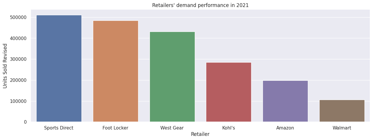
df2021 = df[df["Year"]==2021]df2021Retailer = df2021.groupby(by = "Retailer").agg({'Units Sold Revised':'sum', 'Total Sales Revised':'sum', 'Operating Profit Revised':'sum', 'State':'nunique'}).reset_index(drop = False)df2021Retailer.rename(columns = {'State':'States'}, inplace = True)print(f"Retailer metrics:\n{df2021Retailer}")We begin the charting by plotting a simple bar plot on retailers' demand (i.e. units sold) performance in descending order:
# Show retailers' demand (units sold)sns.barplot(df2021Retailer.sort_values(by = "Units Sold Revised", ascending = False), x = "Retailer", y = "Units Sold Revised").set_title("Retailers' demand performance in 2021")plt.show()# Walmart has lowest demand - why?
Instantly, we see that Walmart is severely lacking behind other retailers. Let's try to understand why that's the case.
This is the part where we come up with hypotheses to explain why Walmart is the lowest-performing retailer, using the data we have imported.
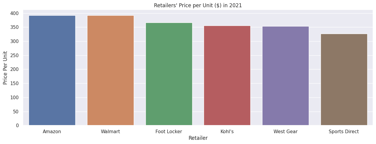
Perhaps its low performance is due to high prices of Adidas products in Walmart compared to other retailers.
# Average price per unitdf2021Retailer["Price Per Unit"] = round(df2021Retailer["Total Sales Revised"]/df2021Retailer["Units Sold Revised"],2)sns.barplot(df2021Retailer.sort_values(by = "Price Per Unit", ascending = False), x = "Retailer", y = "Price Per Unit").set_title("Retailers' Price per Unit ($) in 2021")plt.show()
Walmart's price per unit is slightly below that of Amazon's, but not significantly higher than the rest of the retailers.
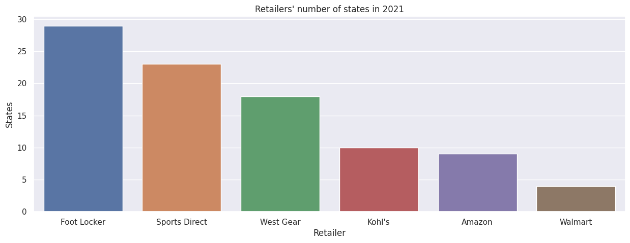
Could the low performance in units sold for Walmart be then attributed to its low coverage, i.e. number of states across the United States? Let's have a look.
sns.barplot(df2021Retailer.sort_values(by = "States", ascending = False), x = "Retailer", y = "States").set_title("Retailers' number of states in 2021")plt.show()# Walmart has the least coverage with 4 states - does Walmart's per-state demand of good relative quality?
Alright, we see a strong possibility that the low demand is attributed to the few states (four states) where Adidas products are sold via Walmart.
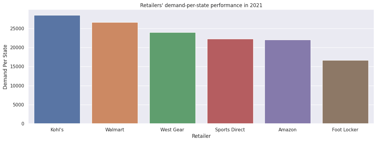
Although Walmart has the lowest demand performance overall, it is an unfair comparison with other retailers, because other retailers have more than double the number of states as Walmart. Hence, we establish a more objective comparison by looking at per-state demand.
df2021Retailer["Demand Per State"] = round(df2021Retailer["Units Sold Revised"]/df2021Retailer["States"],0)sns.barplot(df2021Retailer.sort_values(by = "Demand Per State", ascending = False), x = "Retailer", y = "Demand Per State").set_title("Retailers' demand-per-state performance in 2021")plt.show()# On average, Walmart performed better than all retailers except Kohl's for each state# Action: Lets increase coverage for Walmart, i.e. double the number of states for Walmart assuming each state for Walmart performs well for demand at more than 25,000 units sold
Through a different lens, Walmart now is the second-best retailer in terms of demand per-state, just behind Kohl's.
In this case, increasing Adidas coverage with Walmart to four more states will indeed boost demand and sales overall, assuming each new state rakes in more than 25,000 unit sales in a year.
Conclusion
We have completed an end-to-end analysis of a sales dataset to see how we can improve retailers' performance.
Next, we shall explore how to forecast sales using various methods, starting with simpler ones like trends and moving averages.
Stay tuned by subscribing to our mailing list so you don't miss out on our new exciting articles when they're released!